Design System & Guide Rules
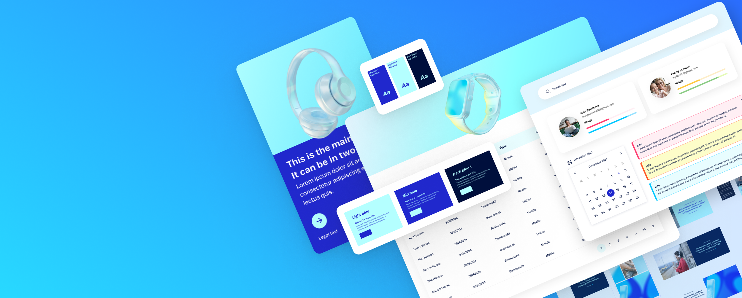
In this project, I was responsible for developing UI components and defining clear guidelines for the development team. I collaborated closely with fellow designers and front-end developers to establish a structured component library, ensuring seamless integration with the EpiServer setup. The result was a scalable and well-documented design system that enhanced consistency and efficiency across the product.
Business Goal
The primary business goal is to create a scalable, efficient, and user-friendly design system that enhances the consistency and usability of the product. By streamlining the design-to-development process, the system aims to improve user engagement, support marketing efforts, and drive business growth through seamless, accessible, and visually appealing interfaces.
Colour Palette
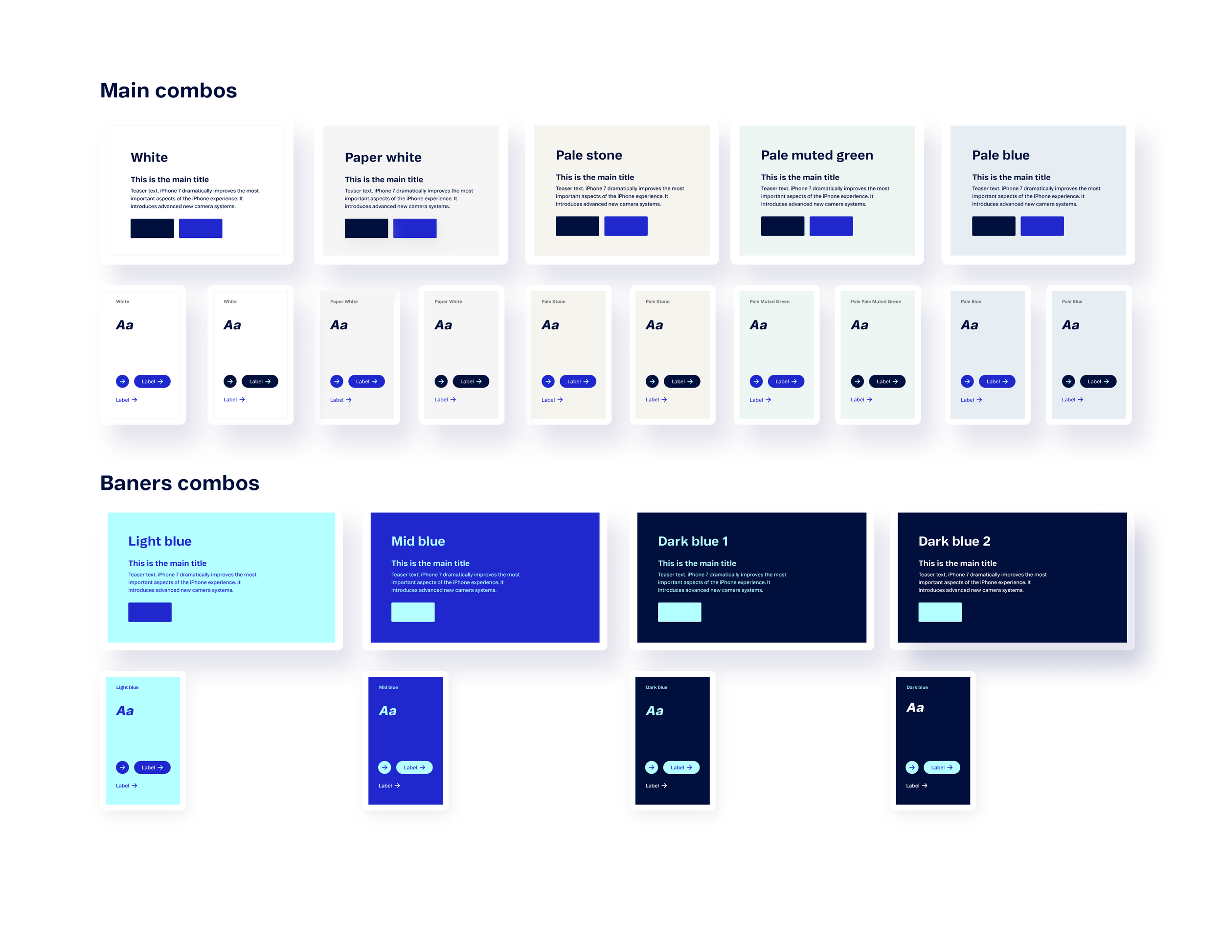
The color palette includes a primary color group, a faded gray palette, and an additional accent color group. These colors are strategically used for backgrounds and various message types, ensuring visual consistency and clear communication across the interface.
Themes
Theming enabled a systematic approach to visual design by defining consistent combinations of background colors, buttons, links, icons, and fonts. We structured themes into two main categories: standard themes with light, pale backgrounds for core UI elements and accent themes used exclusively for marketing campaigns. This approach ensured a cohesive and adaptable design language across different contexts.
Typography
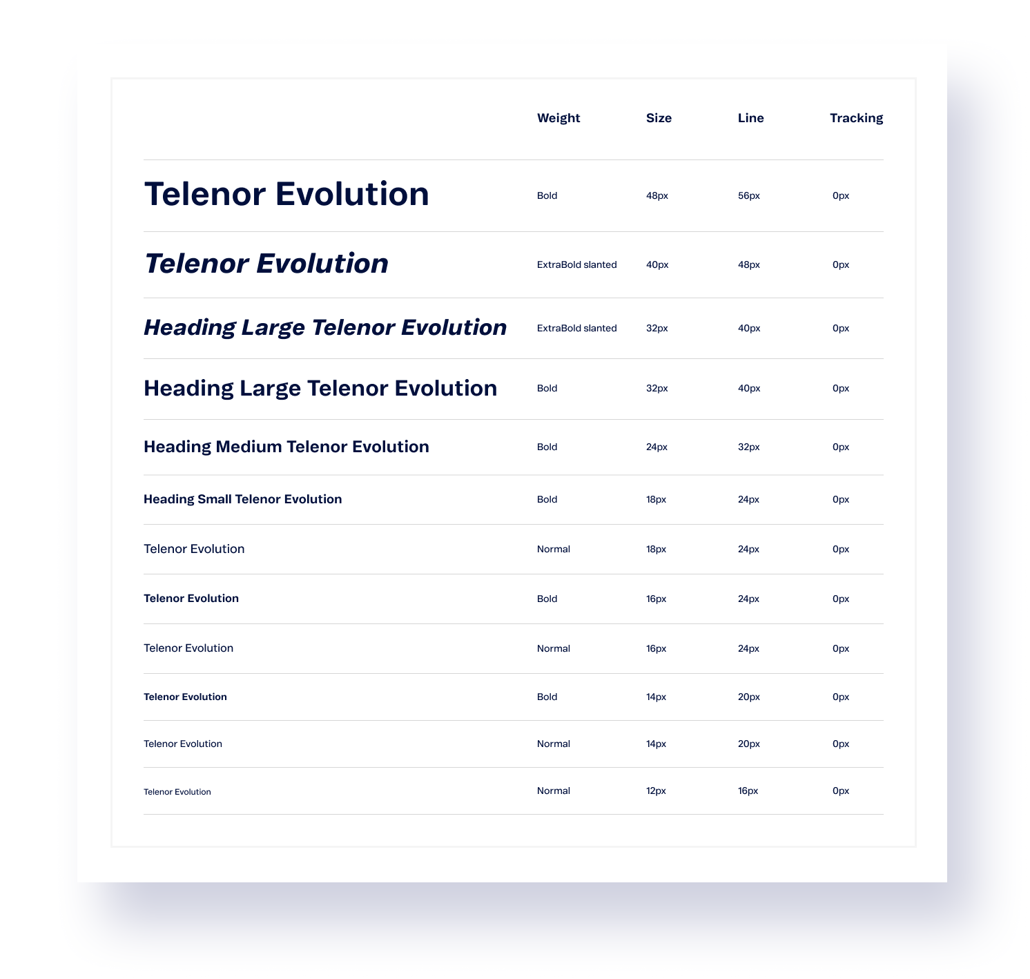
Our typography system is built around a single custom font: Telenor Evolution, used in Extra Bold Slanted, Bold, and Regular weights. This unified approach reinforces brand identity, ensuring a clear and consistent visual message while enhancing readability and usability across the product.Baseline Grid
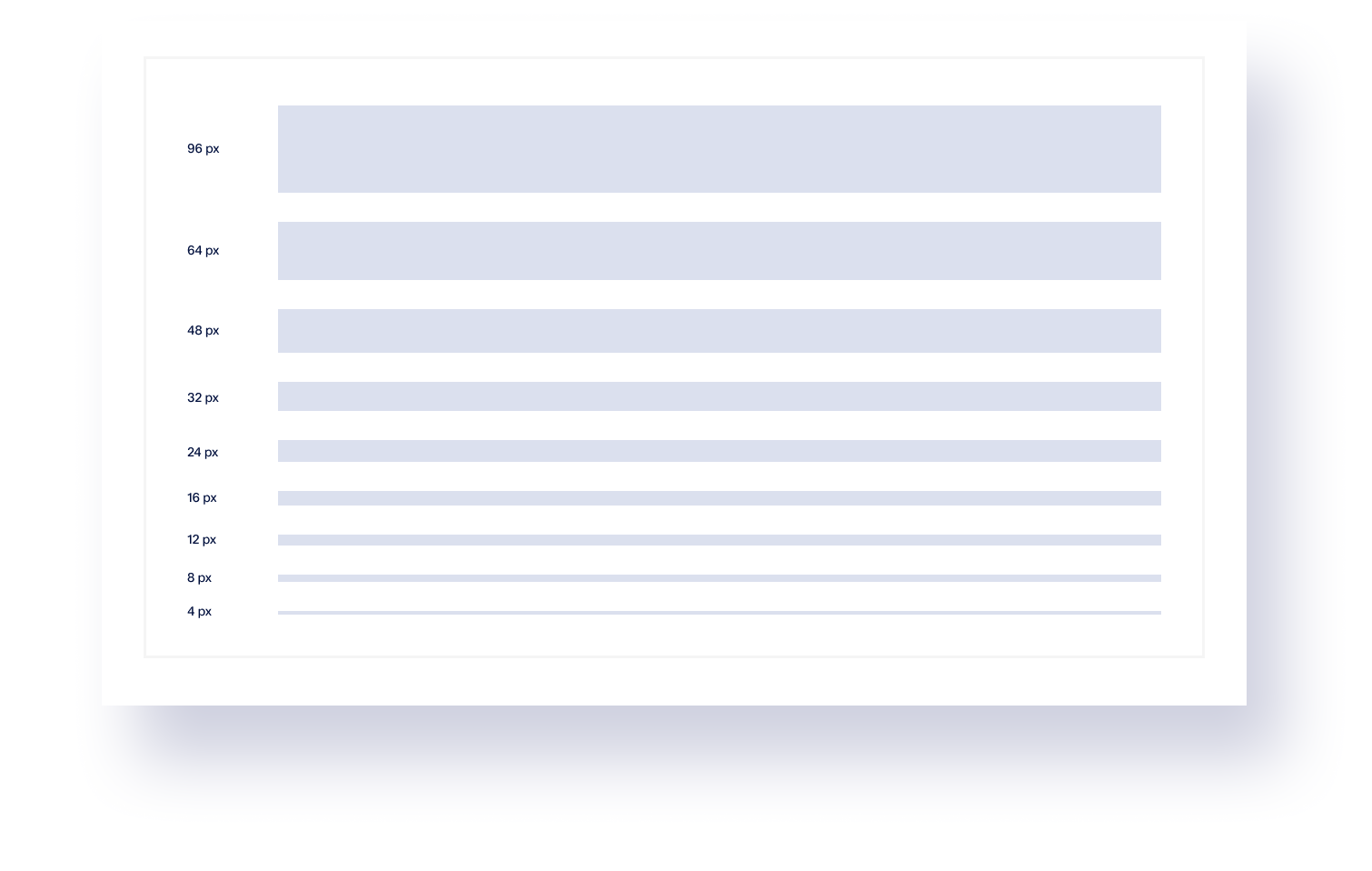
Our design system is structured around a 4-pixel grid, ensuring precision and consistency across all components. This approach enhances visual alignment, improves scalability, and streamlines the design-to-development process for greater efficiency.Episerver Block Structure
We structured Episerver blocks based on atomic design principles, ensuring modularity and reusability. This approach allows for greater flexibility in content creation while maintaining consistency across the system.
UI Components
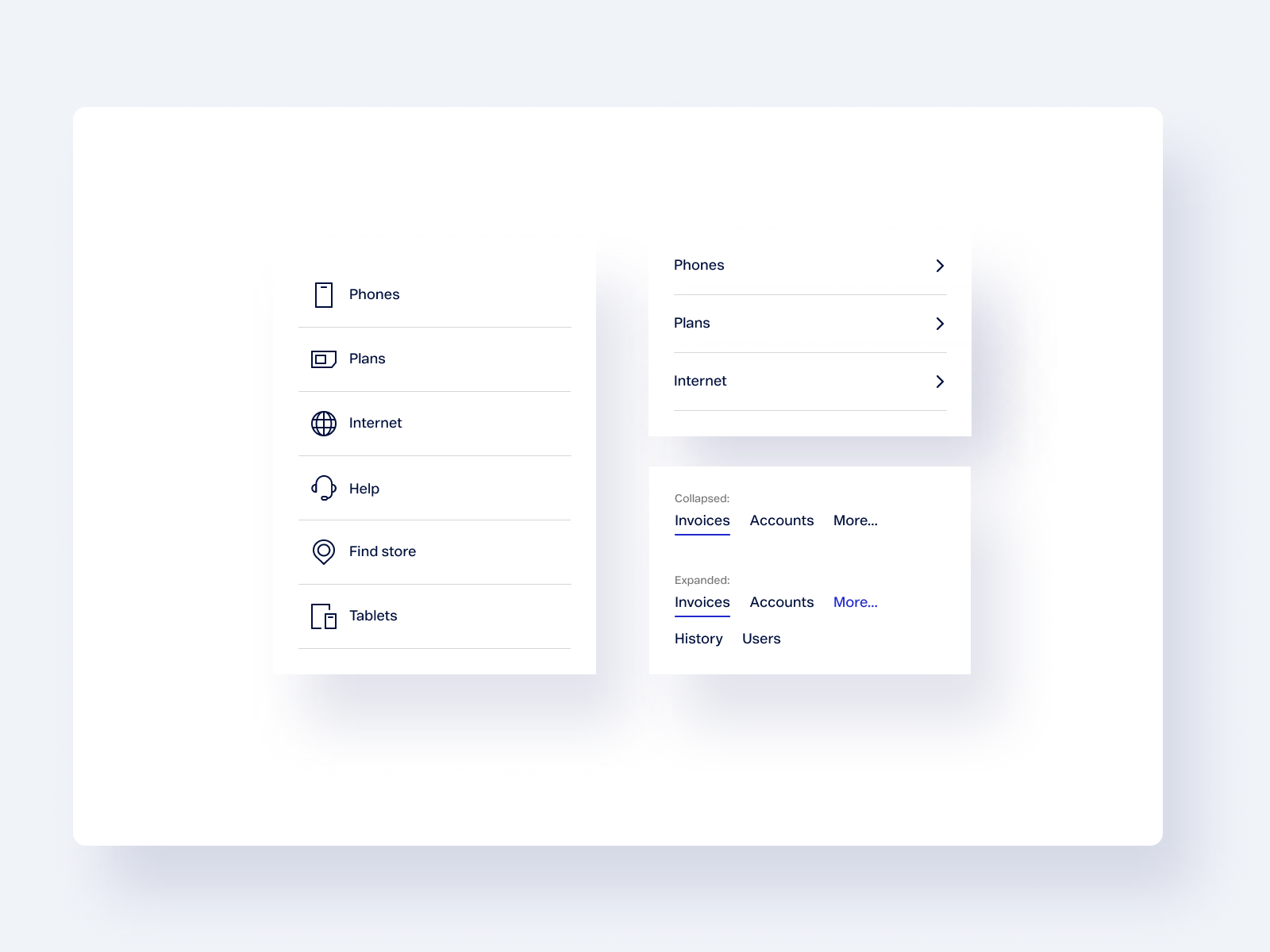
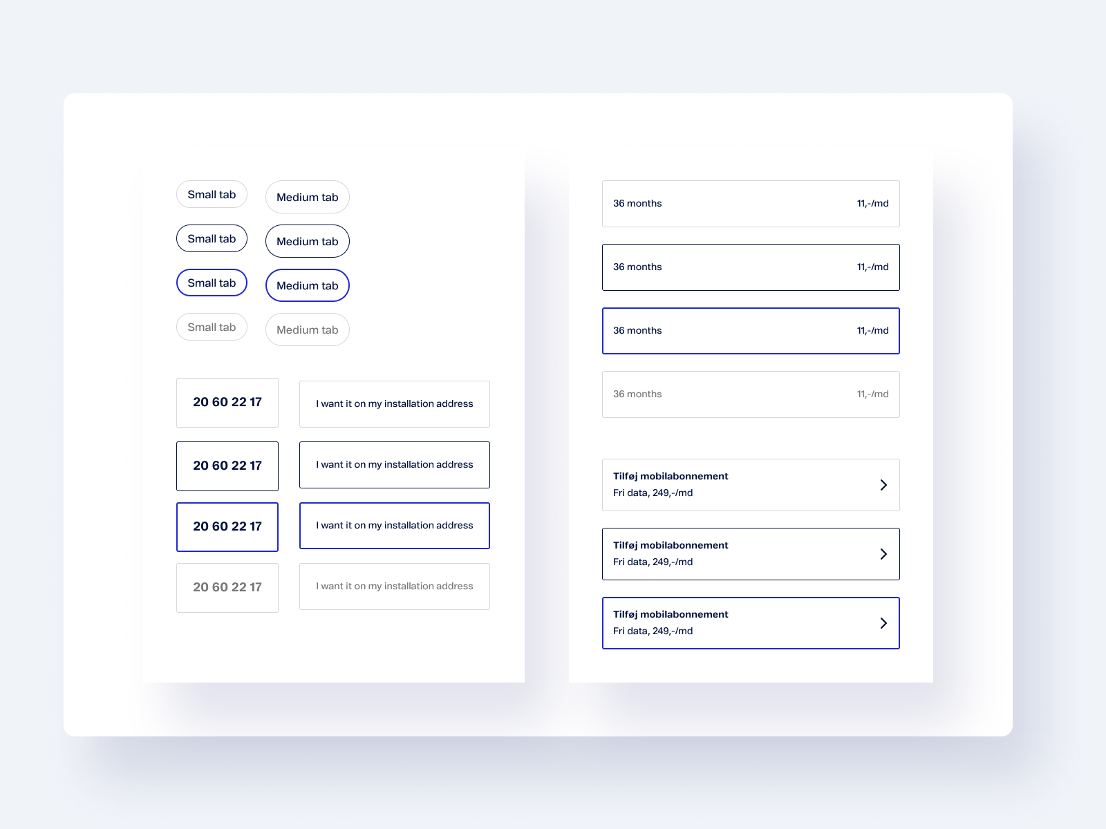
The design system includes a comprehensive set of UI components, such as buttons, input fields, toggles, search elements, and other functional elements. These components ensure consistency, usability, and efficiency across the product interface.


Tables
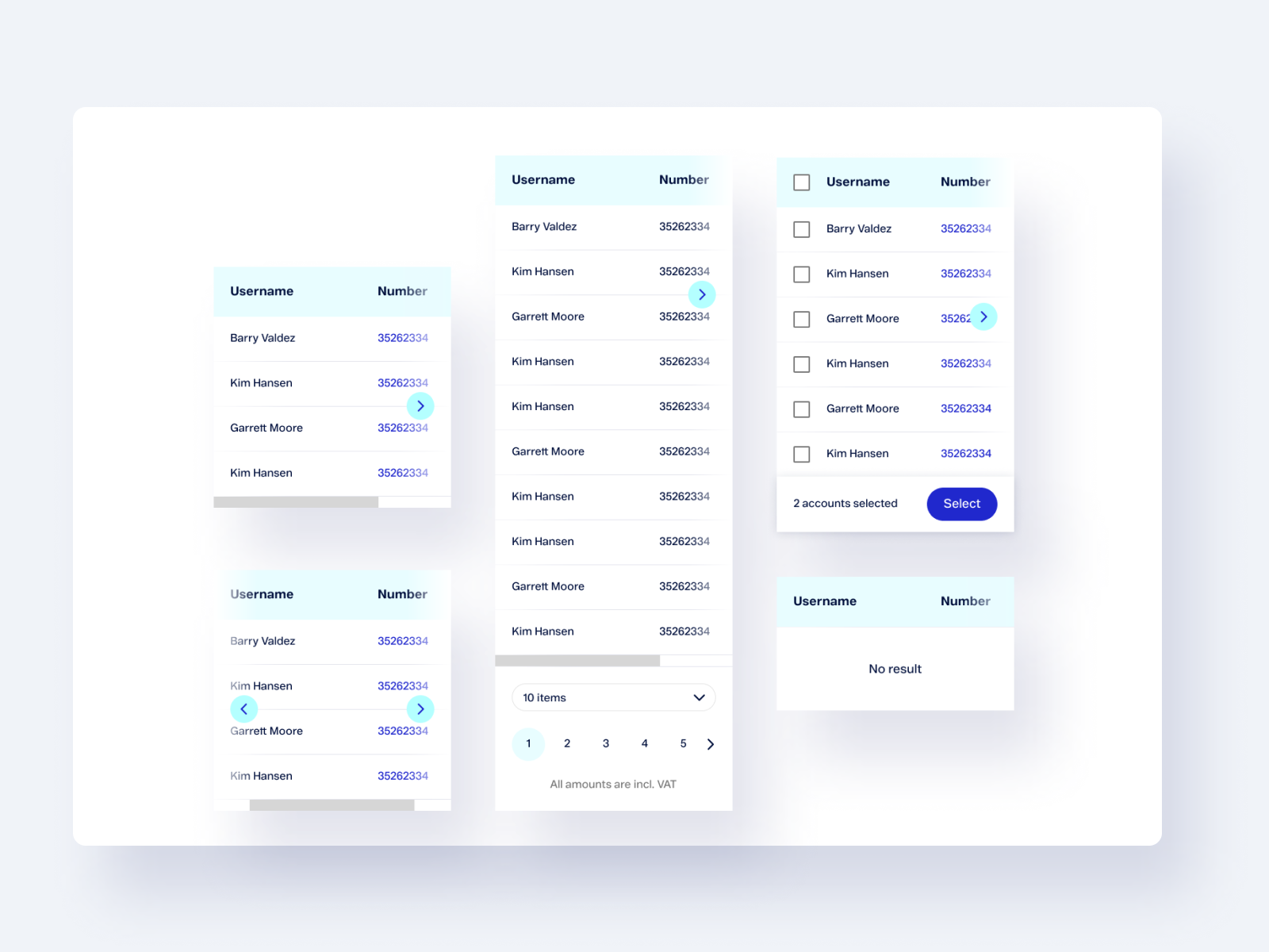
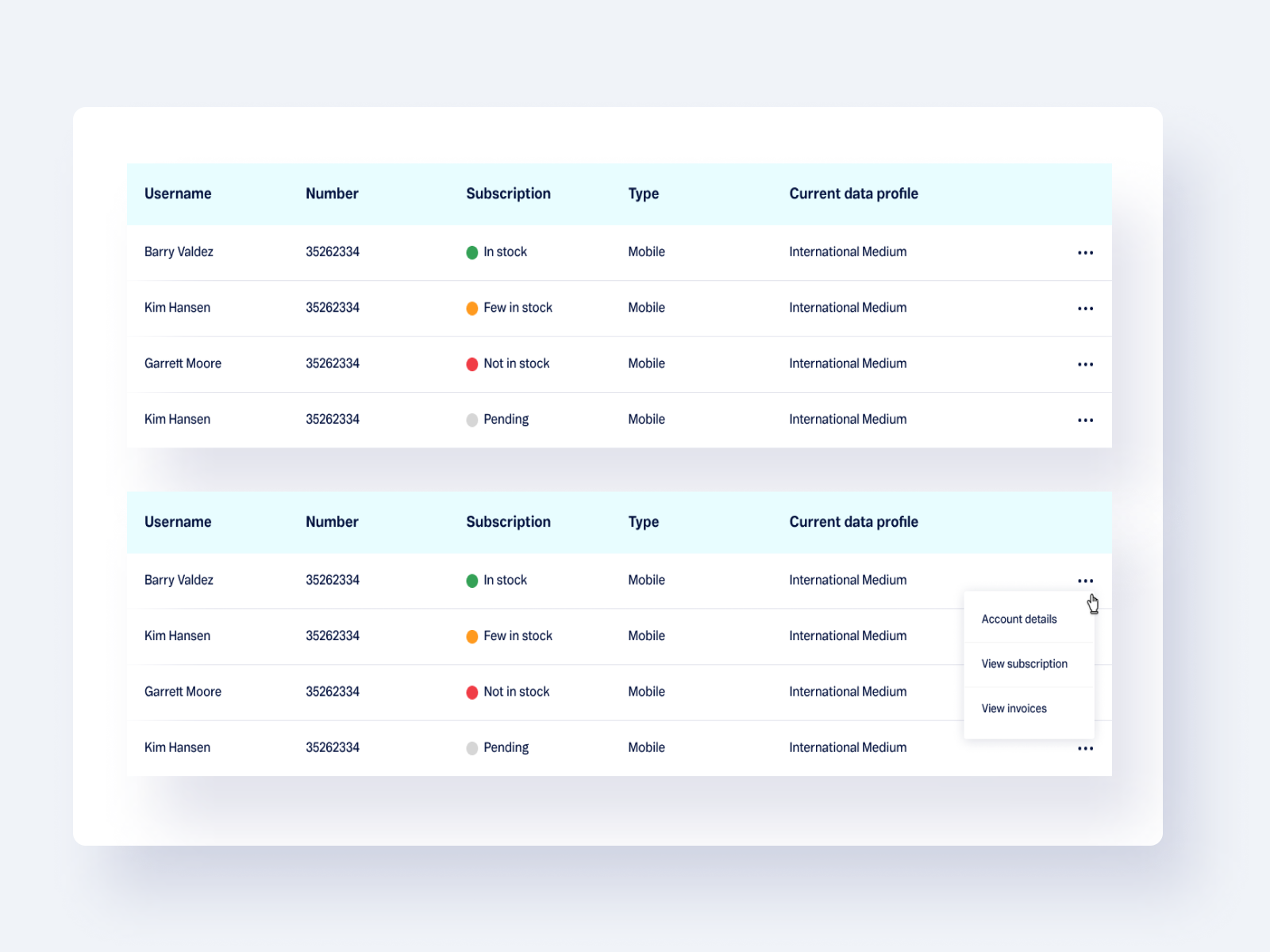
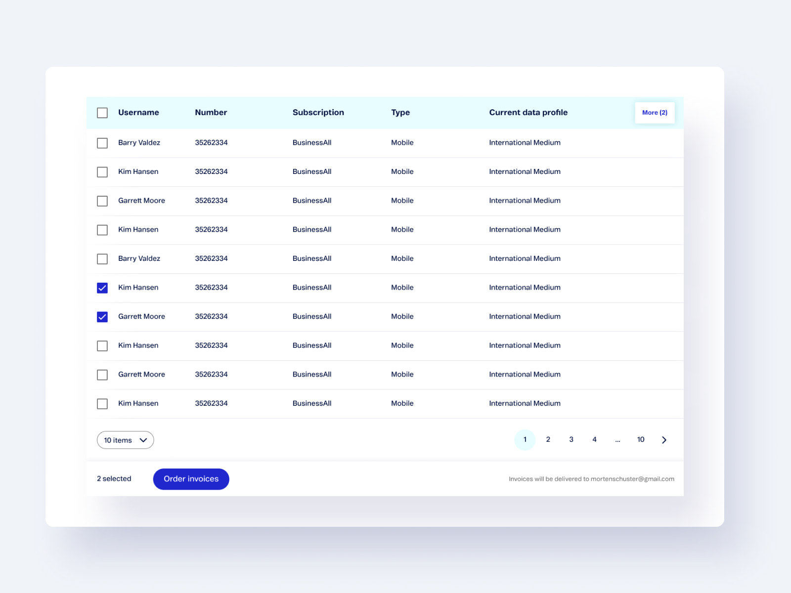
Tables serve as a universal tool for displaying structured data, featuring extensive filtering and customization options. We placed a strong emphasis on optimizing table design for mobile view, ensuring usability and clarity across all devices.

Product Cards
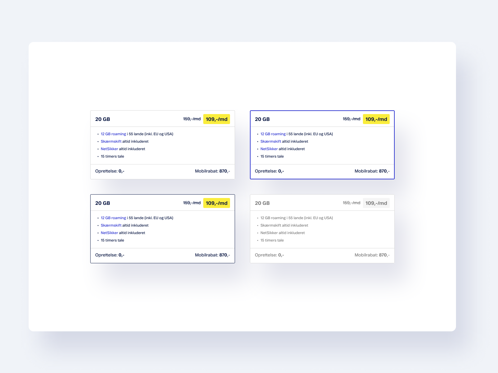
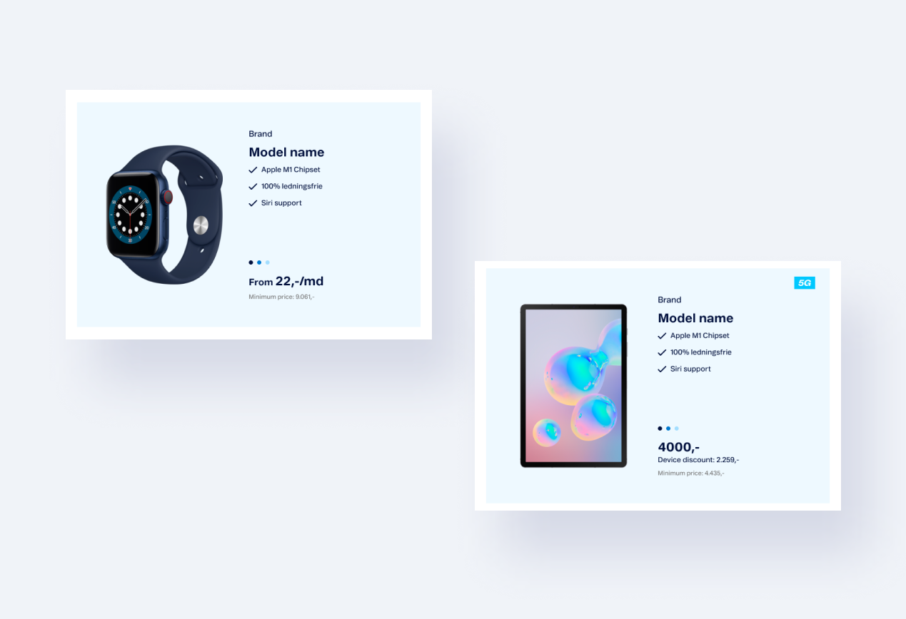
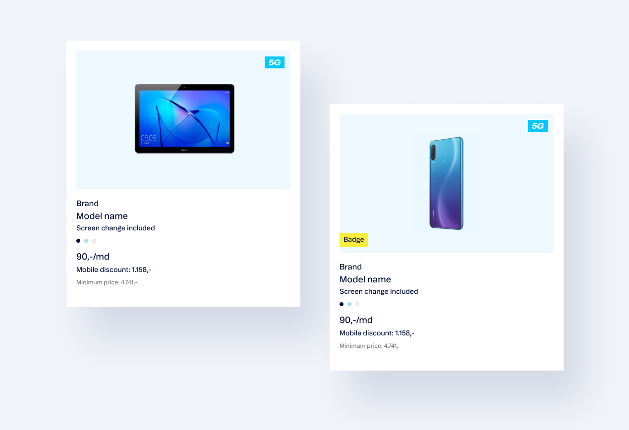
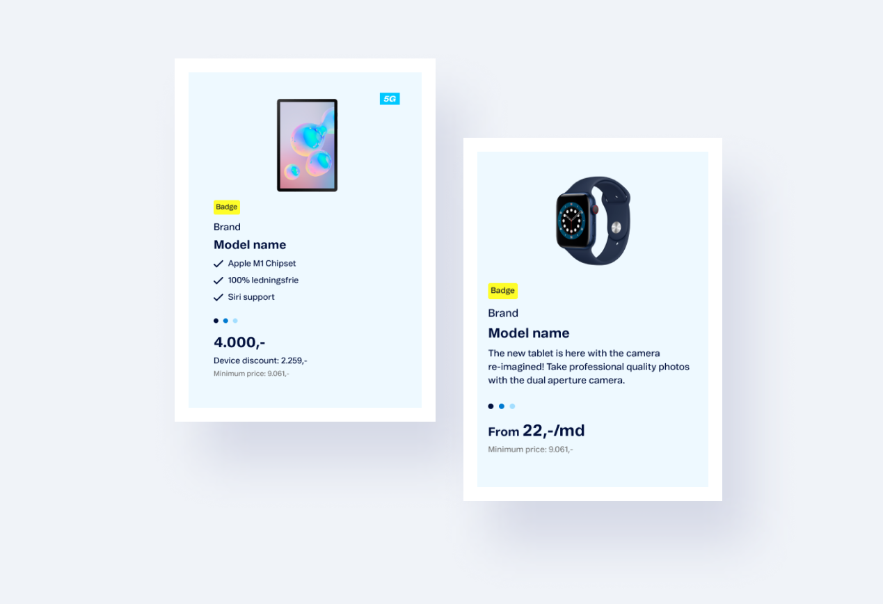
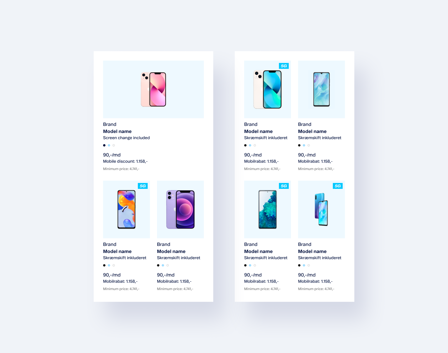
Product cards are designed with flexible layouts, offering views in 6, 4, and 3 columns. For enhanced user experience, additional products can be displayed as a slider, allowing for easy navigation and product exploration.

Information Banners
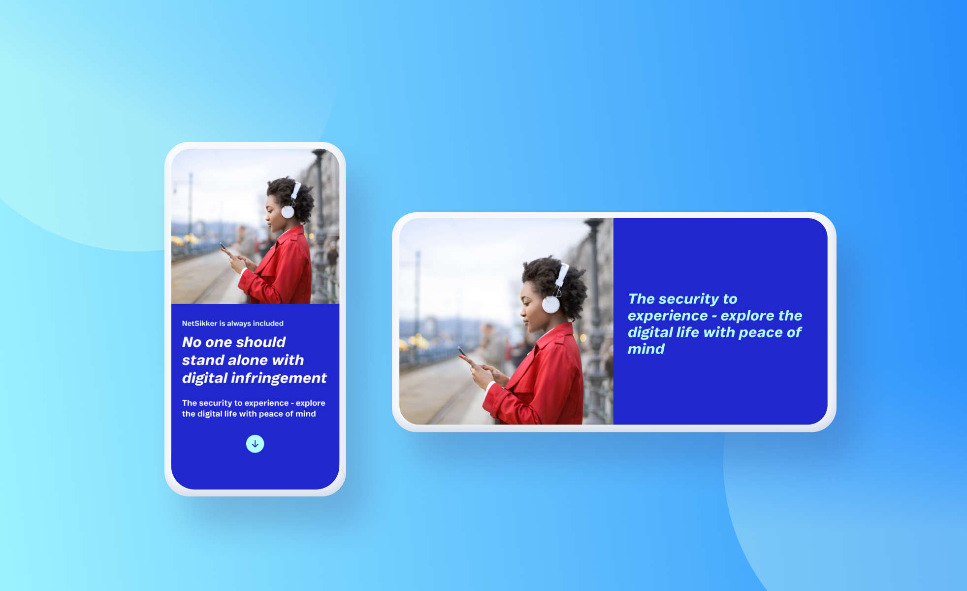
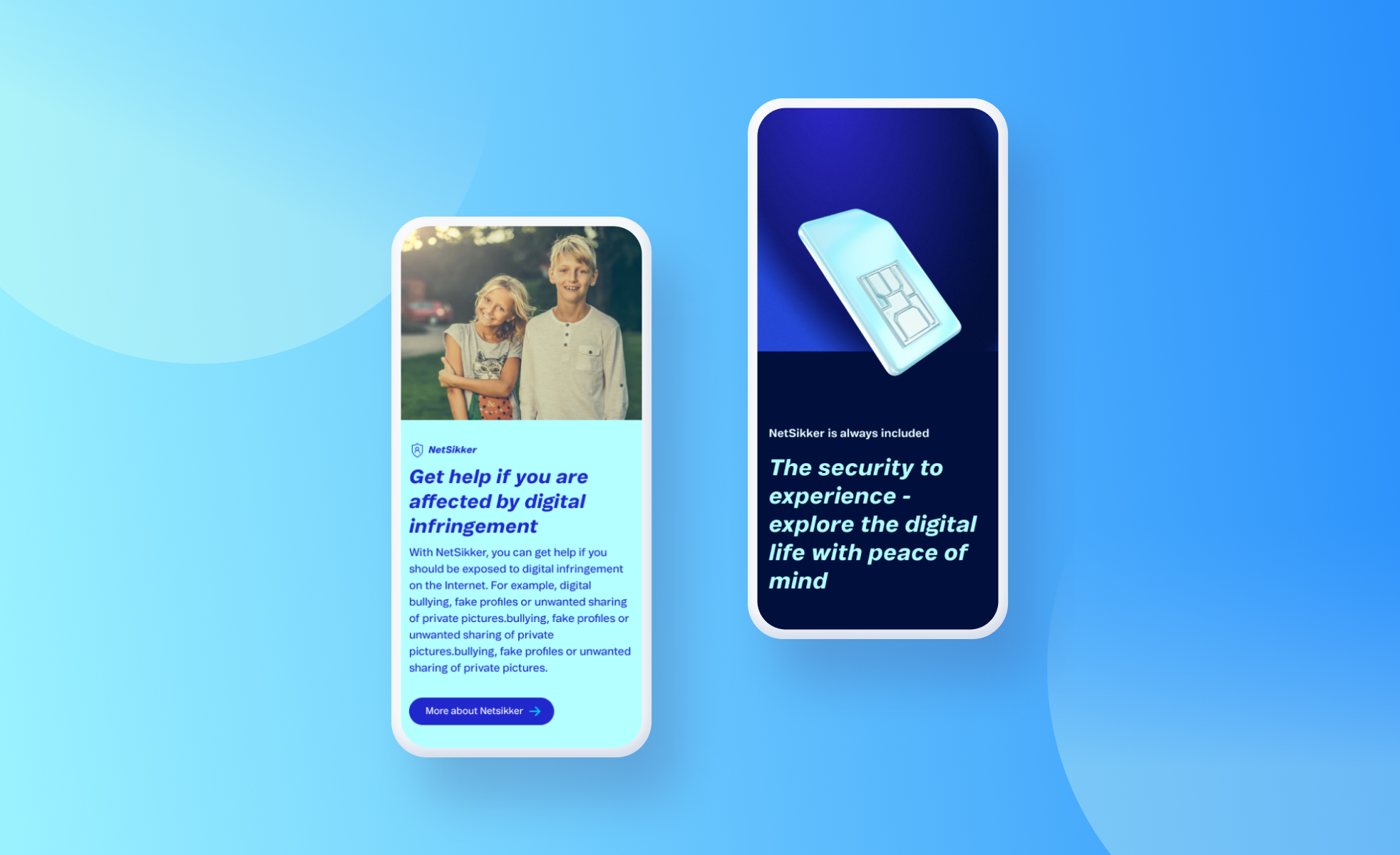
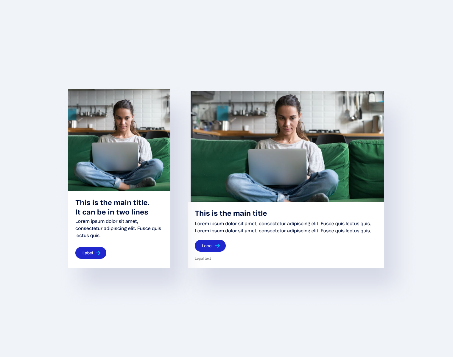
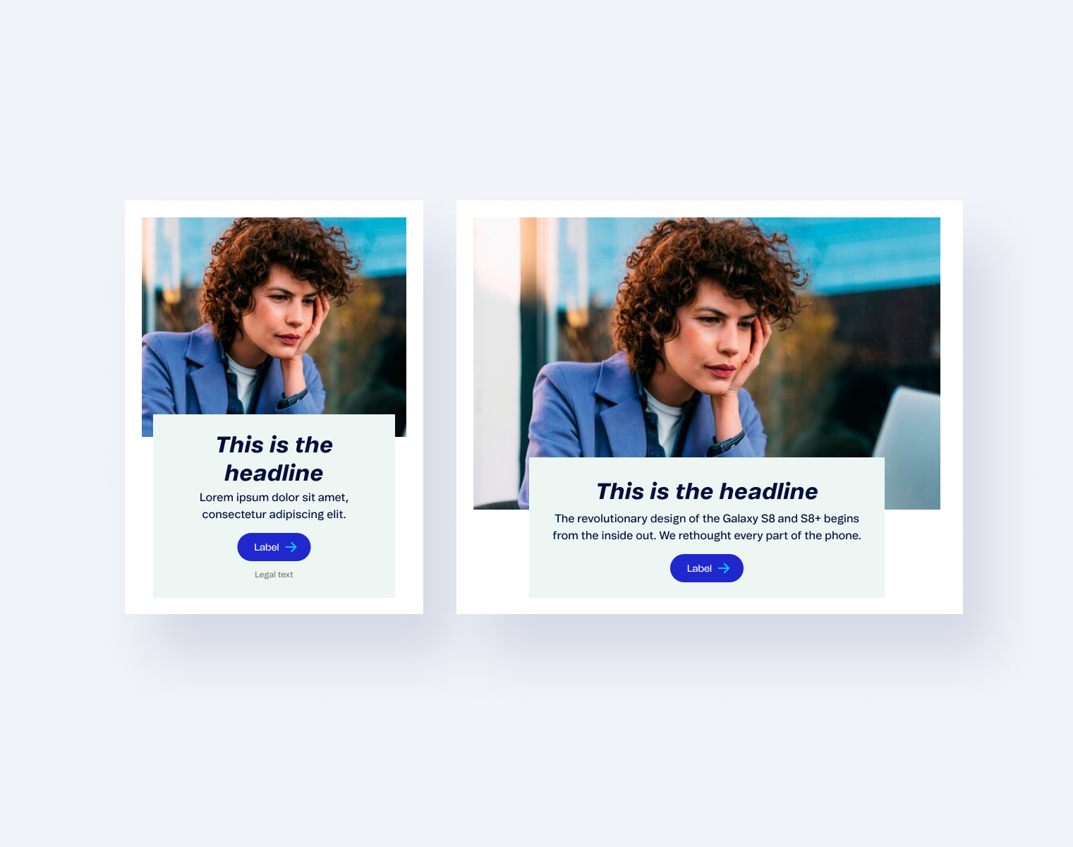
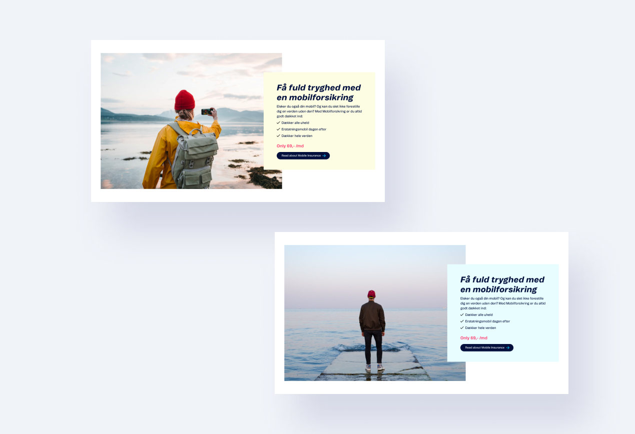
For information banners and content pages, we use calm, pale colors, allowing the content to remain the focal point. The integration of photos into the banners not only enhances visual appeal but also helps create an appropriate atmosphere, enriching the user's perception of the information.

Modals
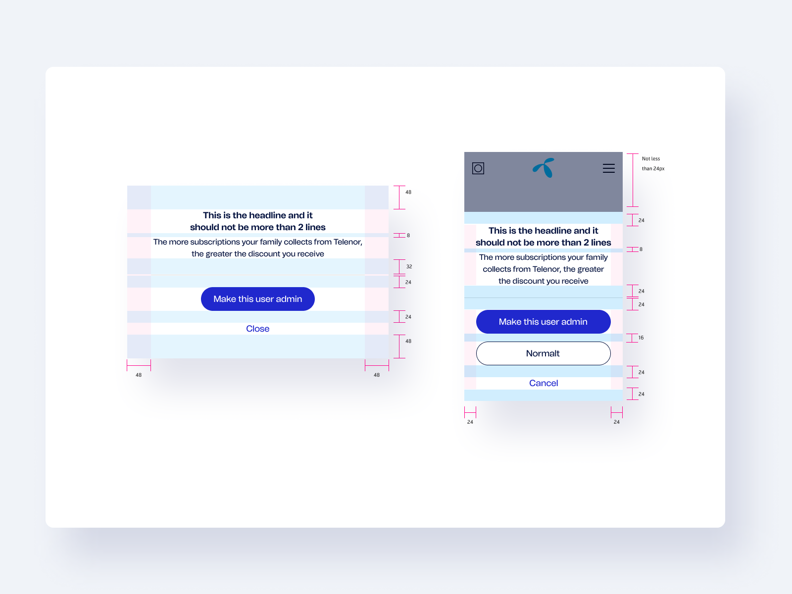
Modals are designed with a focus on clarity and user interaction, using soft, neutral colors to keep the attention on the content. The design ensures that modals provide a smooth and unobtrusive experience, while maintaining a clear separation from the background for better focus.

Banners
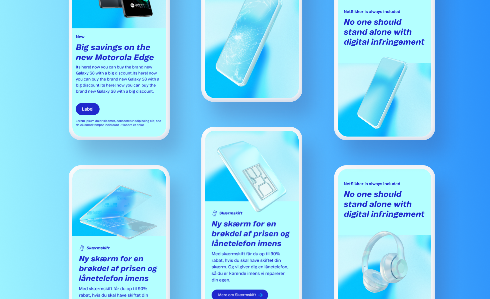
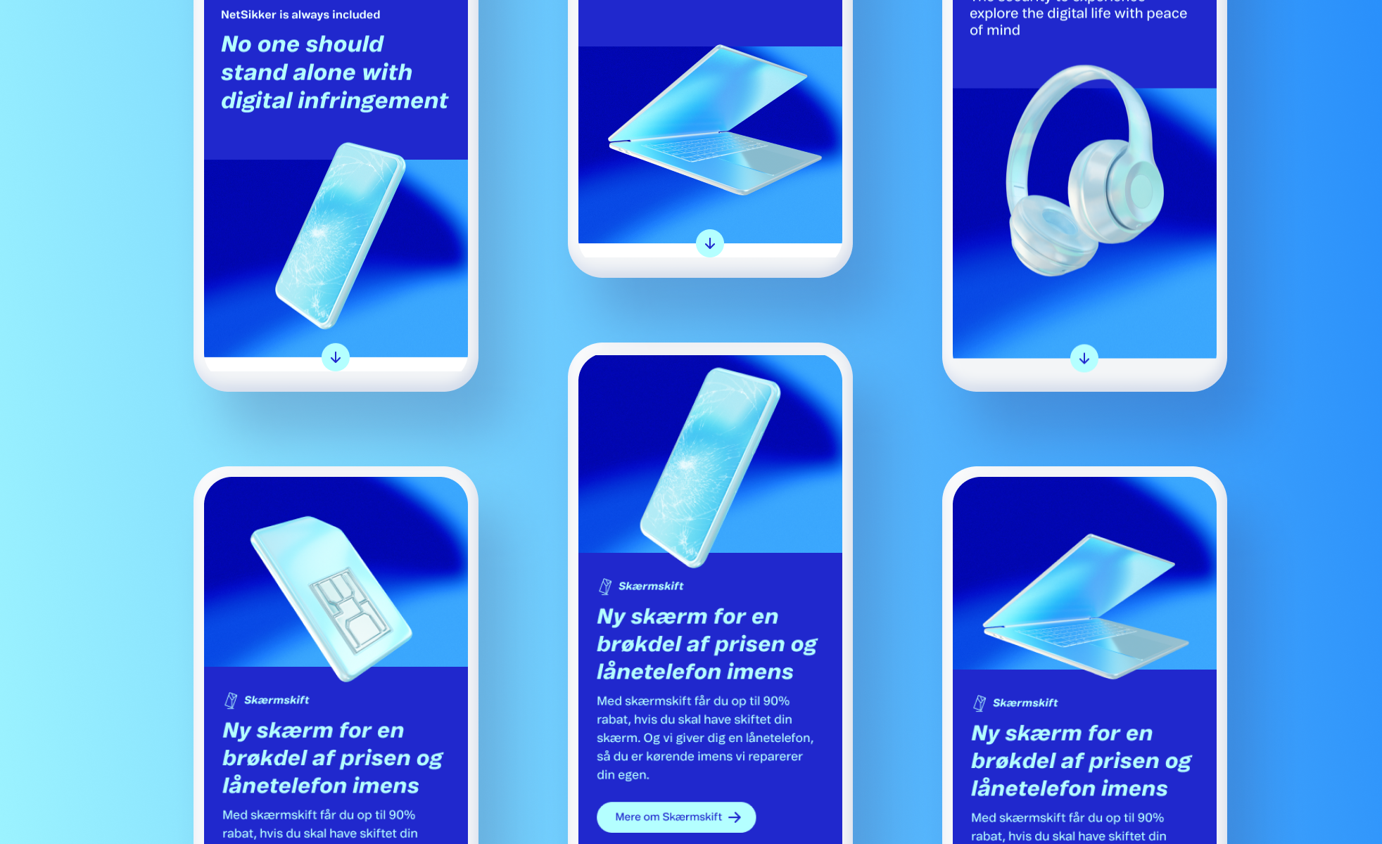
For marketing campaigns, we use bright, attention-grabbing colors to create visual impact. The integration of 3D models further enhances engagement, while animation serves as an additional interactive element to captivate users and drive attention to key content.
