Onsite Design System
Scaling Consistency Through Leadership & Collaboration


Create a consistent, scalable design system tailored to the Onsite department’s needs

Deliver reusable, high-quality design assets that streamline product development and enhance user experiences.
BUSINESS NEEDS


CHALLENGE
Multiple products had diverging UI patterns and inconsistent design.
Lack of shared documentation led to duplicated efforts and misaligned user experiences.
Need to balance global consistency with local Onsite-specific workflows.

MY ROLE
PHASE DURATION


Color Scheme
Adopted the core palette structure from the main company design system, ensuring alignment and brand coherence. At the same time, I defined specific usage rules and context-based guidelines for the Onsite Design System.

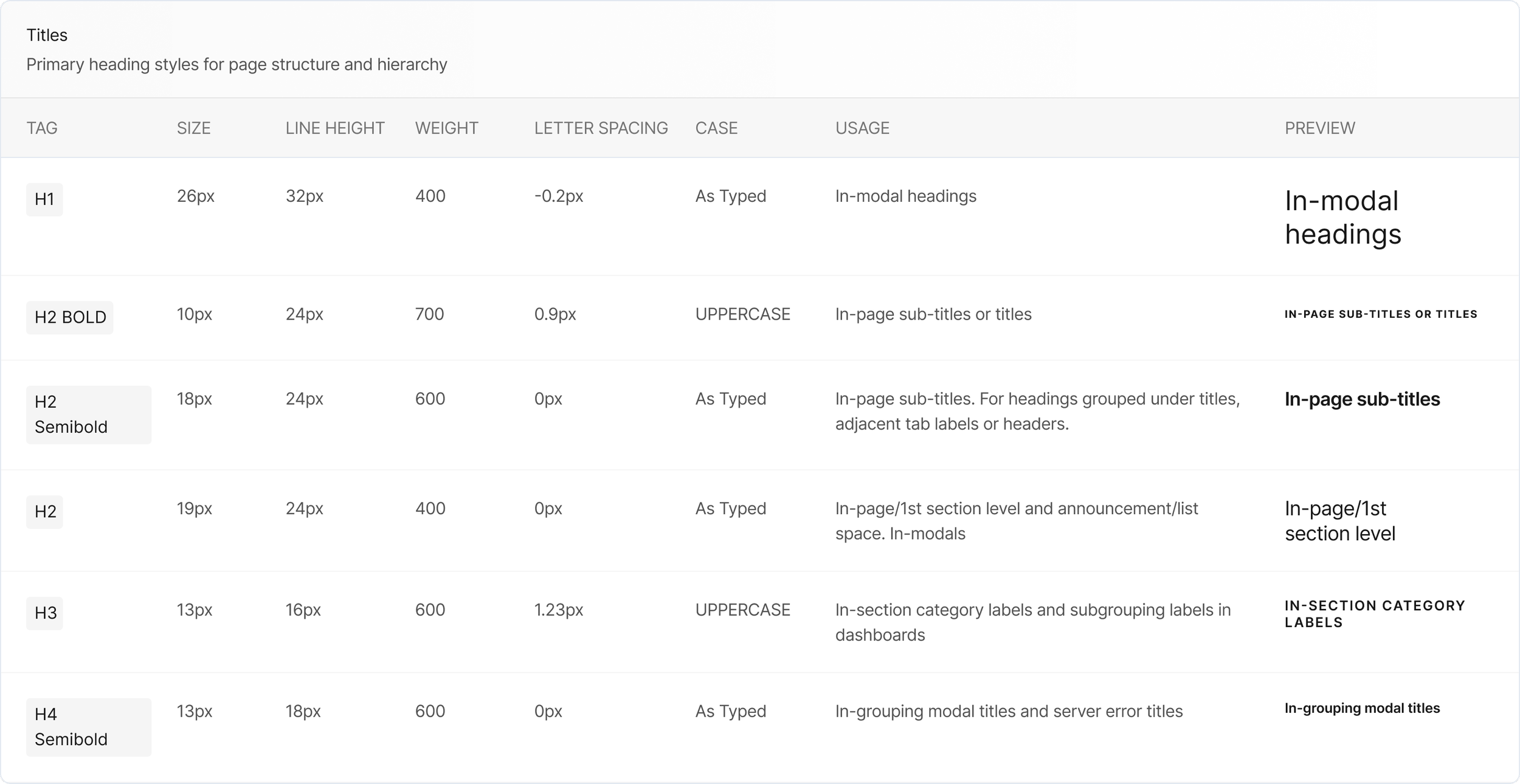
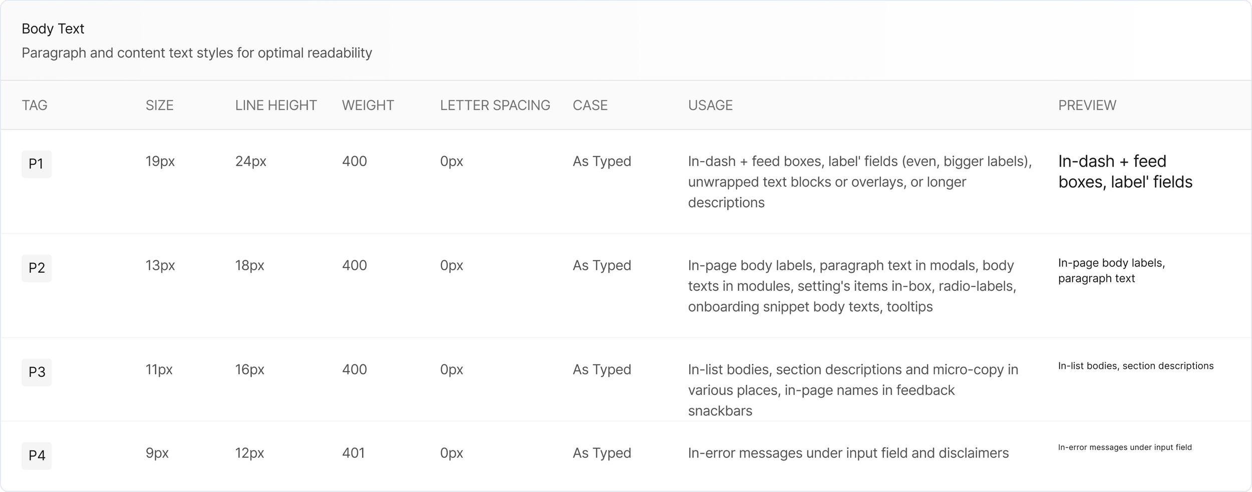
Typography


Button System
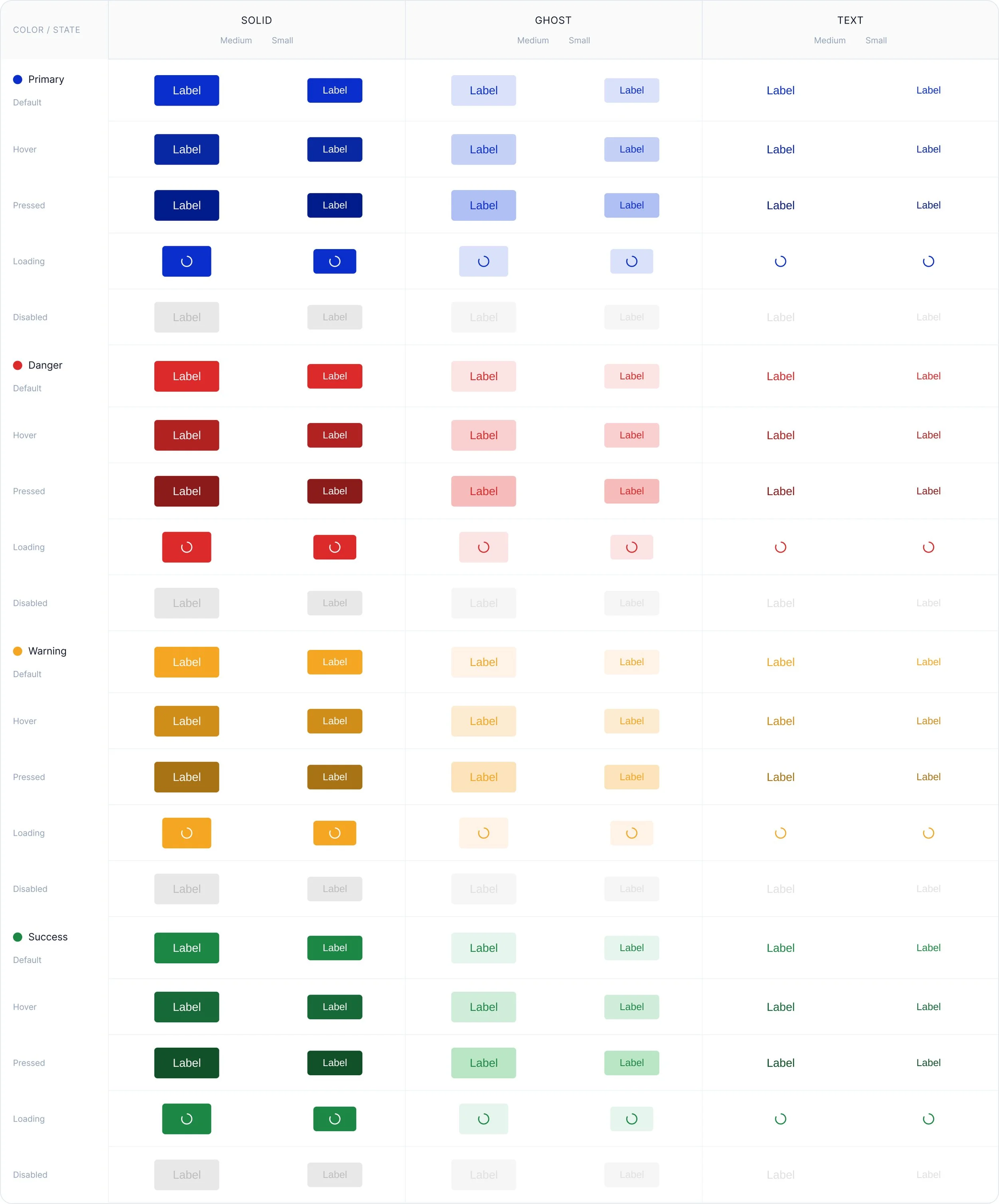
A comprehensive button component system with multiple variants, colors, sizes, and states for all interactive elements in the Onsite product ecosystem.
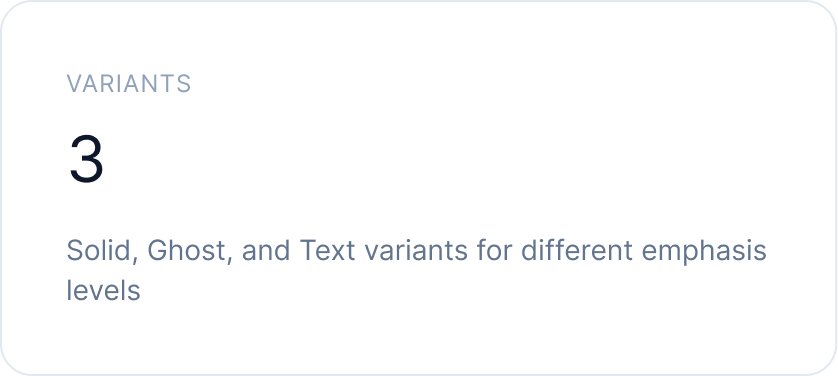
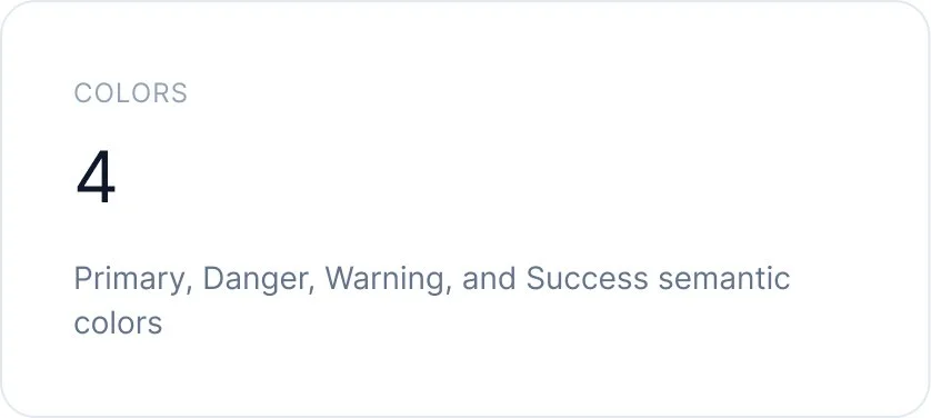
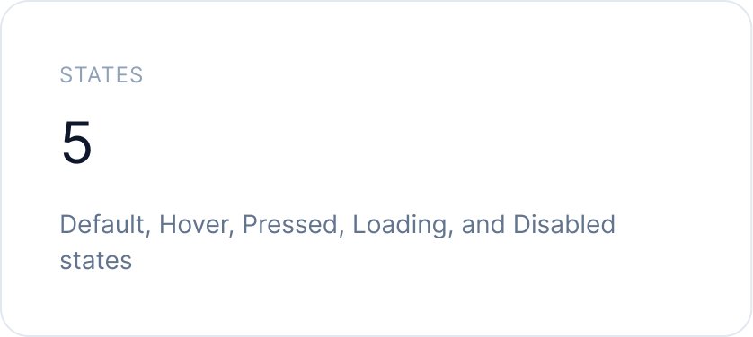
Complete Button Matrix
All button variants, colors, sizes, and states in one comprehensive view

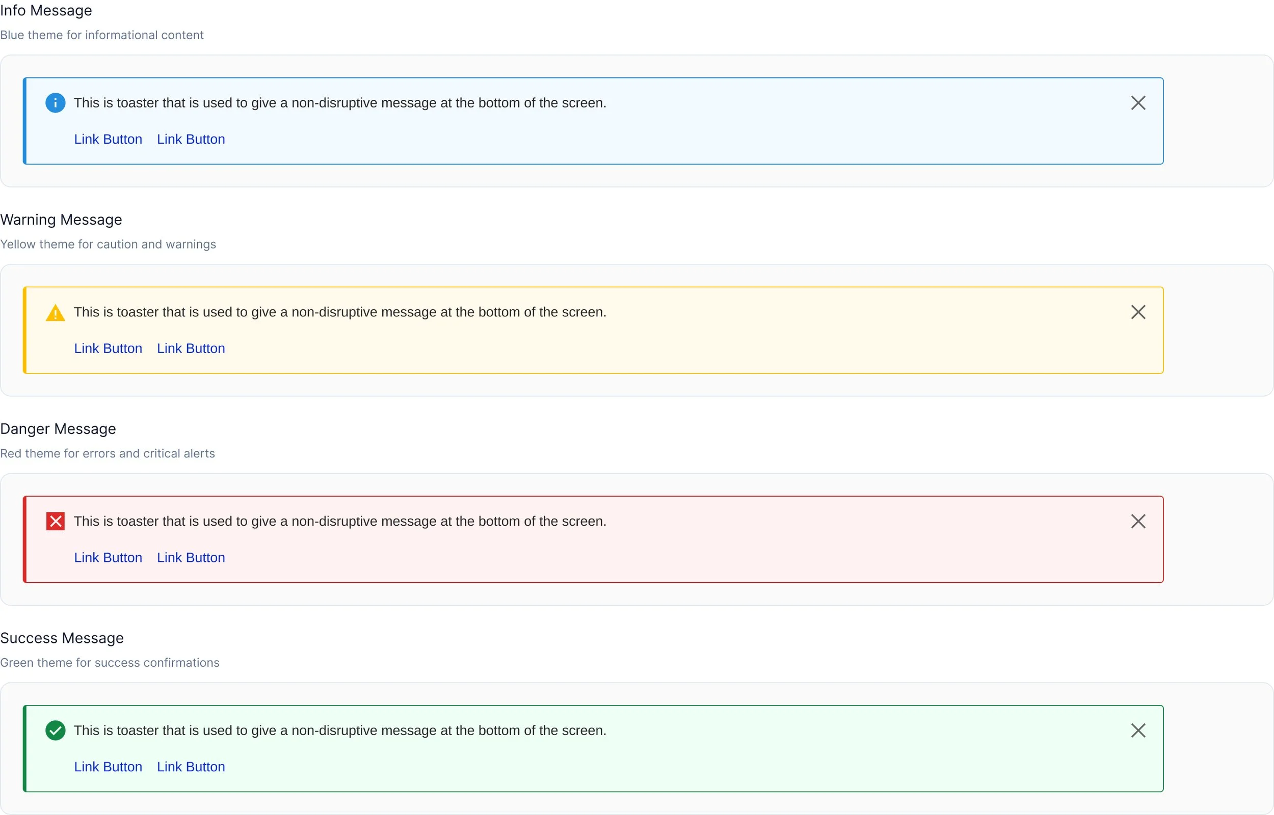
Messages
Inline messages with action buttons for prominent notifications
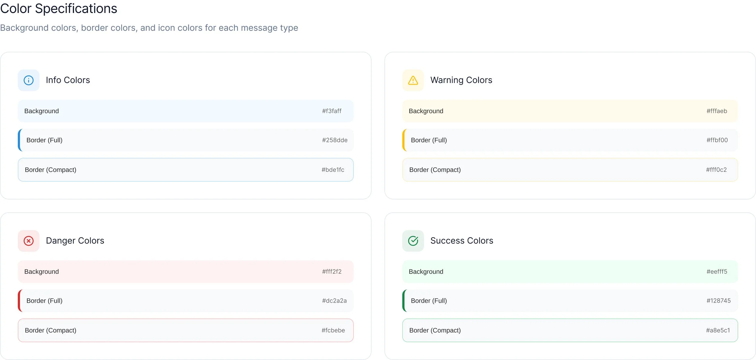
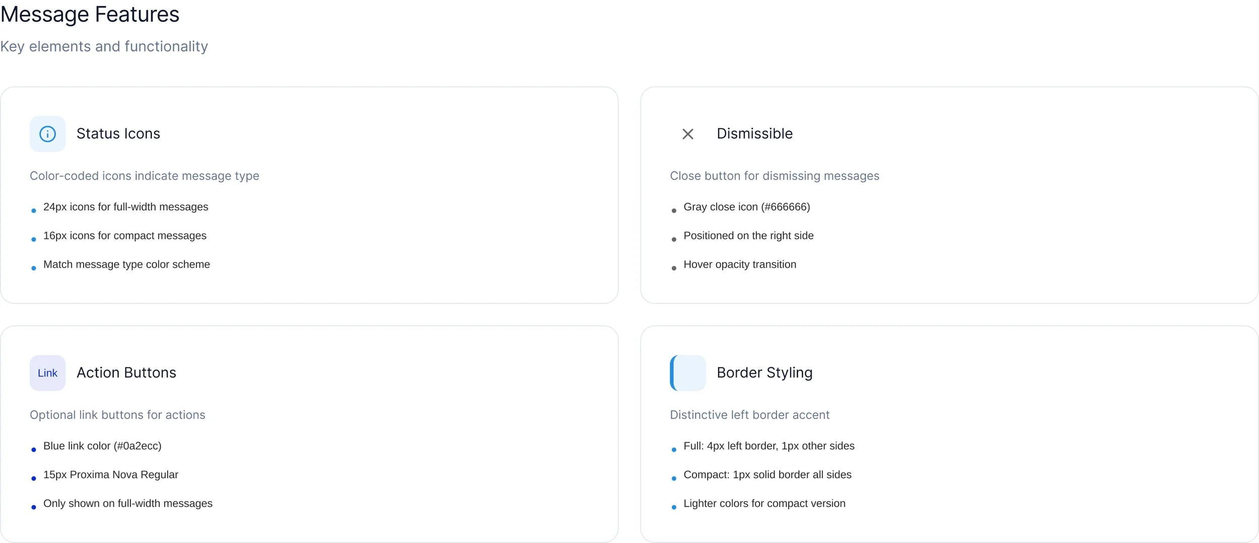
Specifications



Data Entry
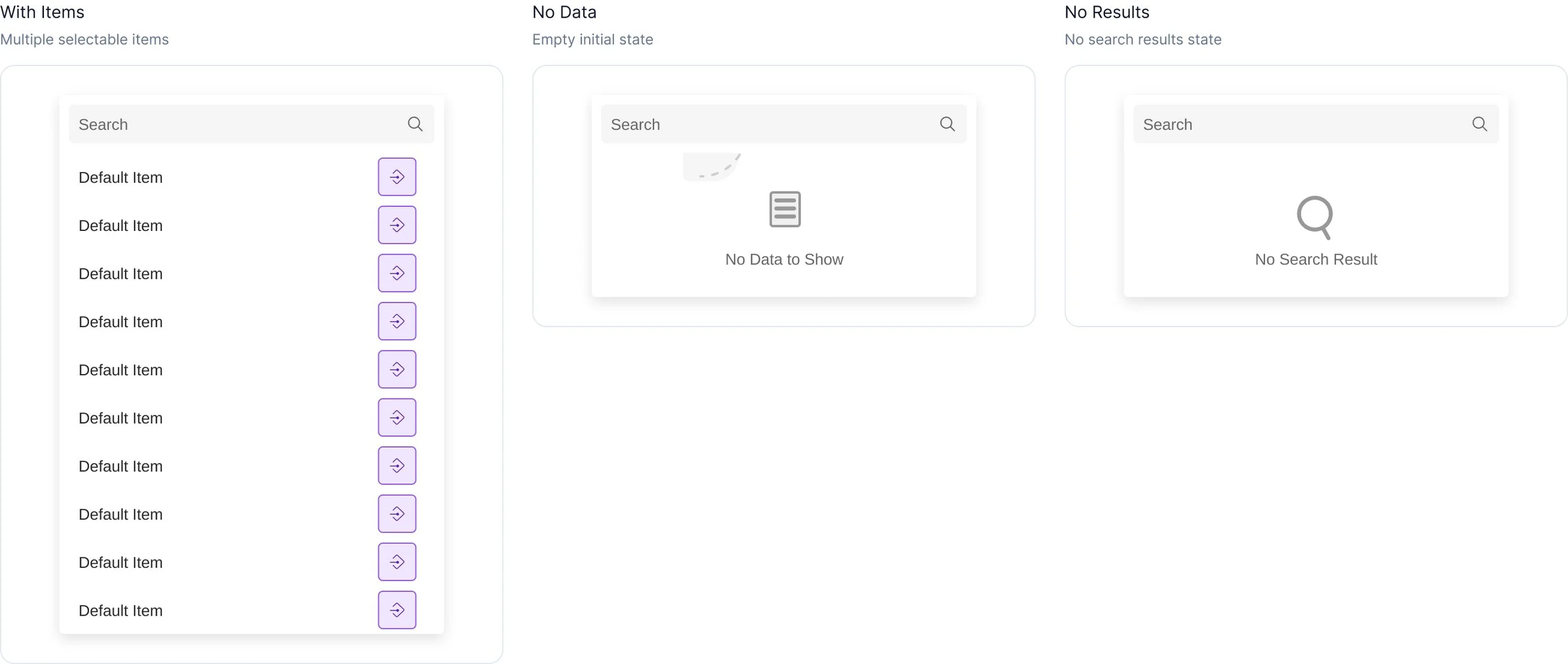
Dropdown menus and input fields with search functionality, validation states.
Dropdown Menus
Searchable dropdown components with scrollable lists, action slots, and empty state handling.
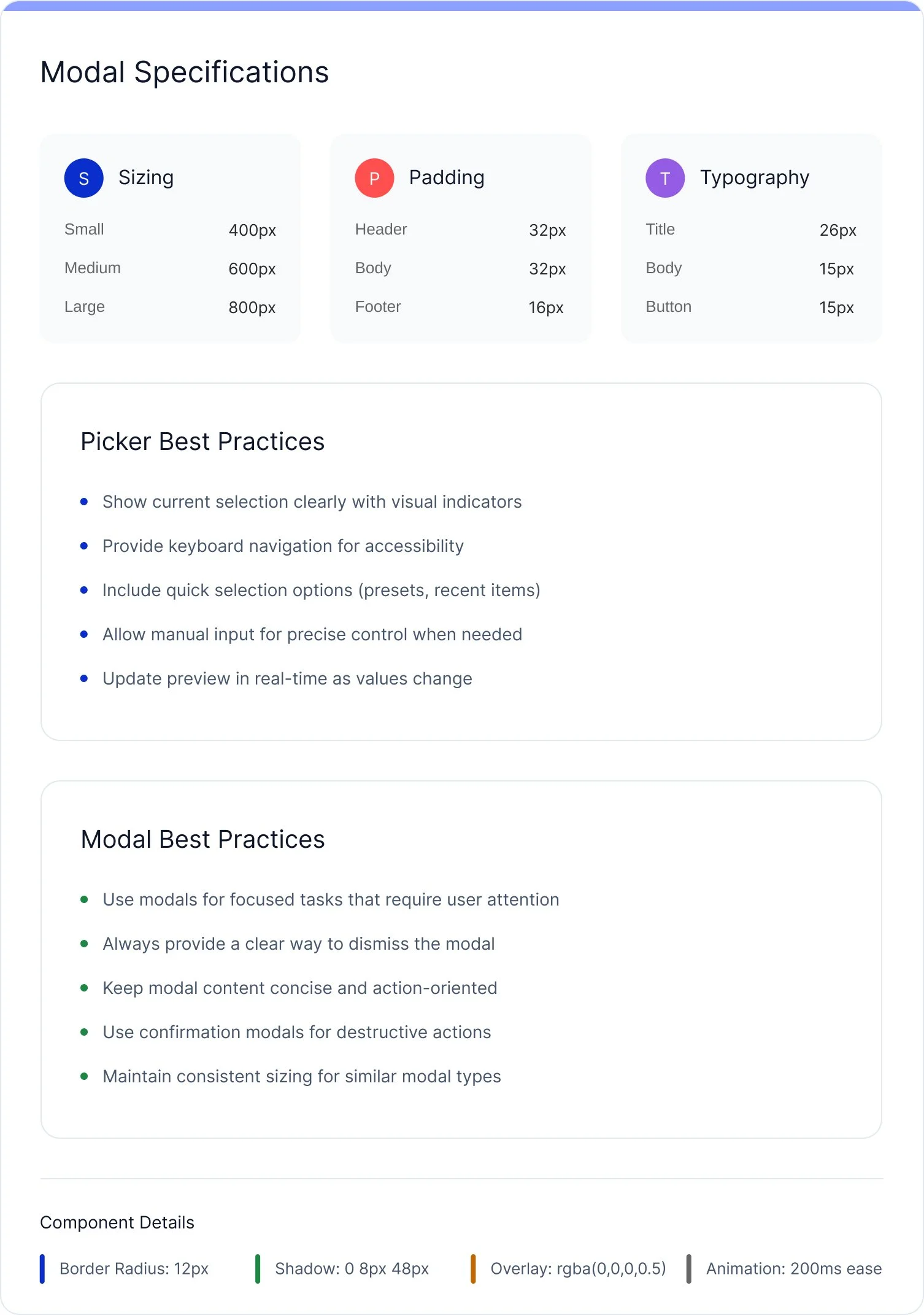
Modals & Pickers
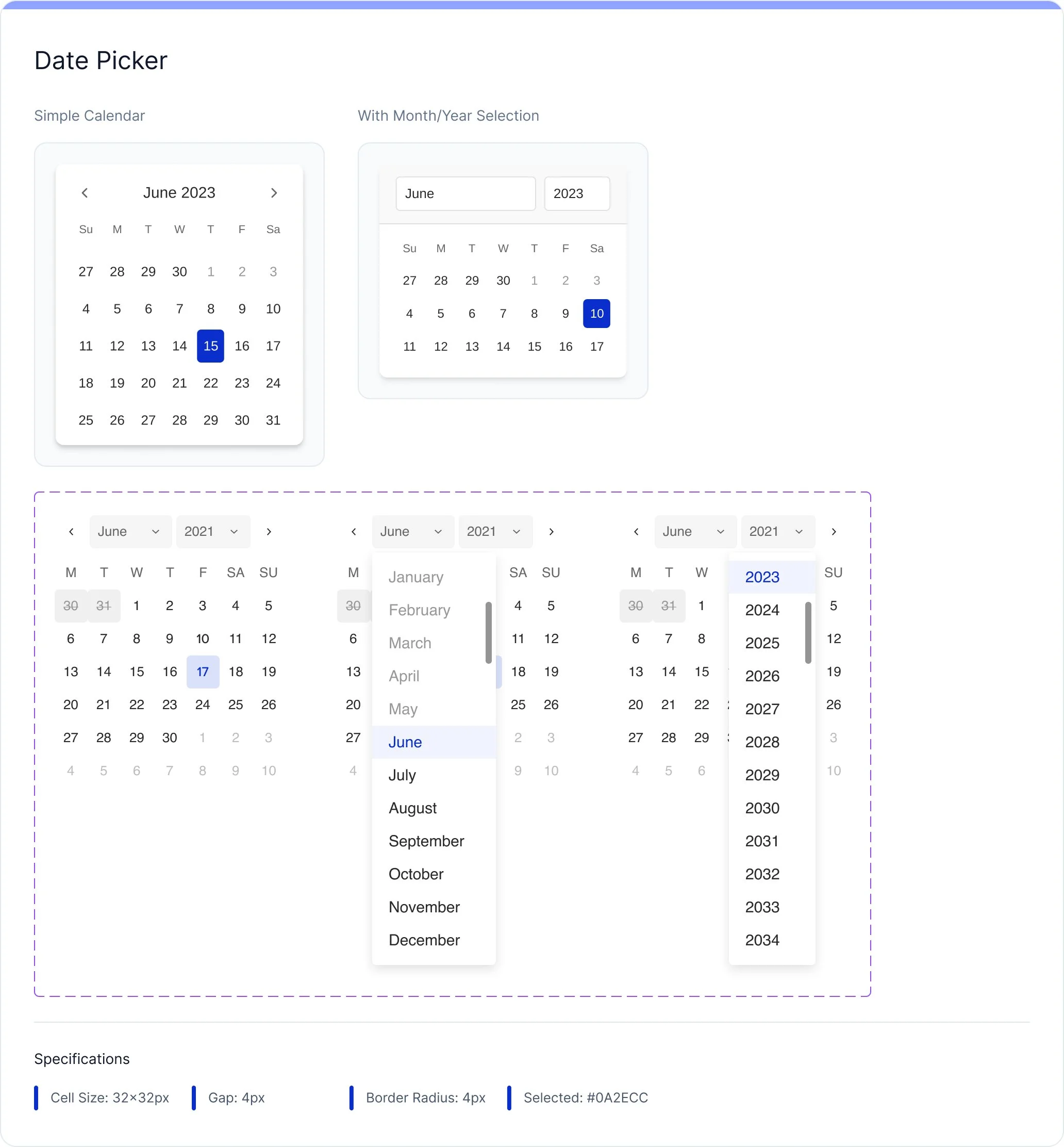
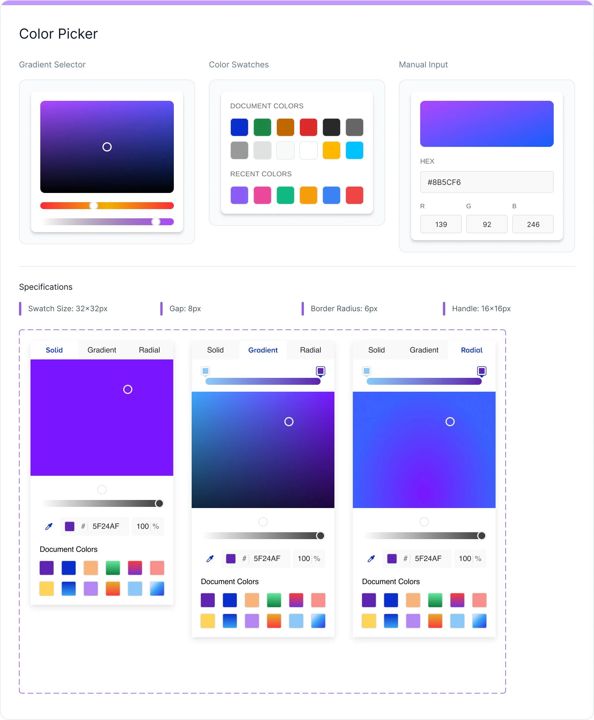
Comprehensive overlay system featuring modal dialogs for focused tasks, date pickers for temporal selection, and color pickers for visual customization.



Design Editor Interface
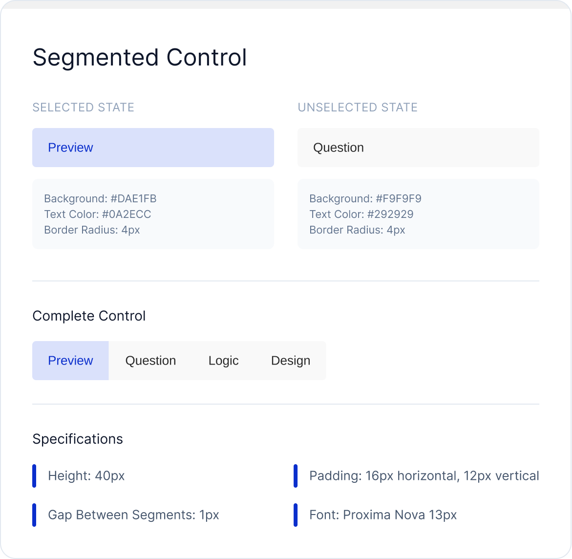
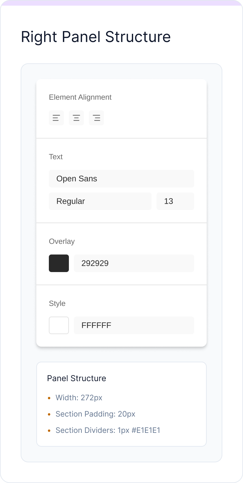
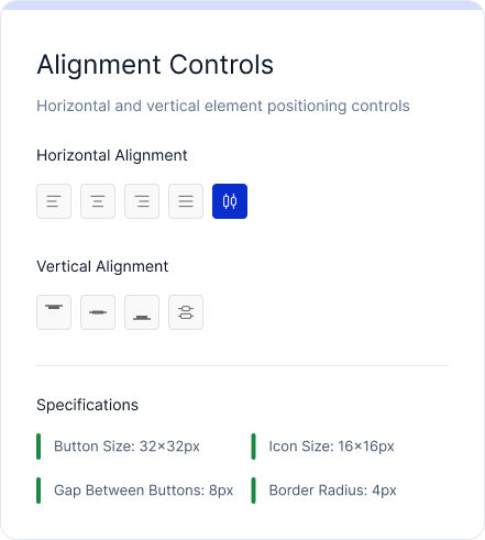
A comprehensive visual editor system featuring segmented navigation, contextual property panels, and precision alignment controls for professional design workflows.


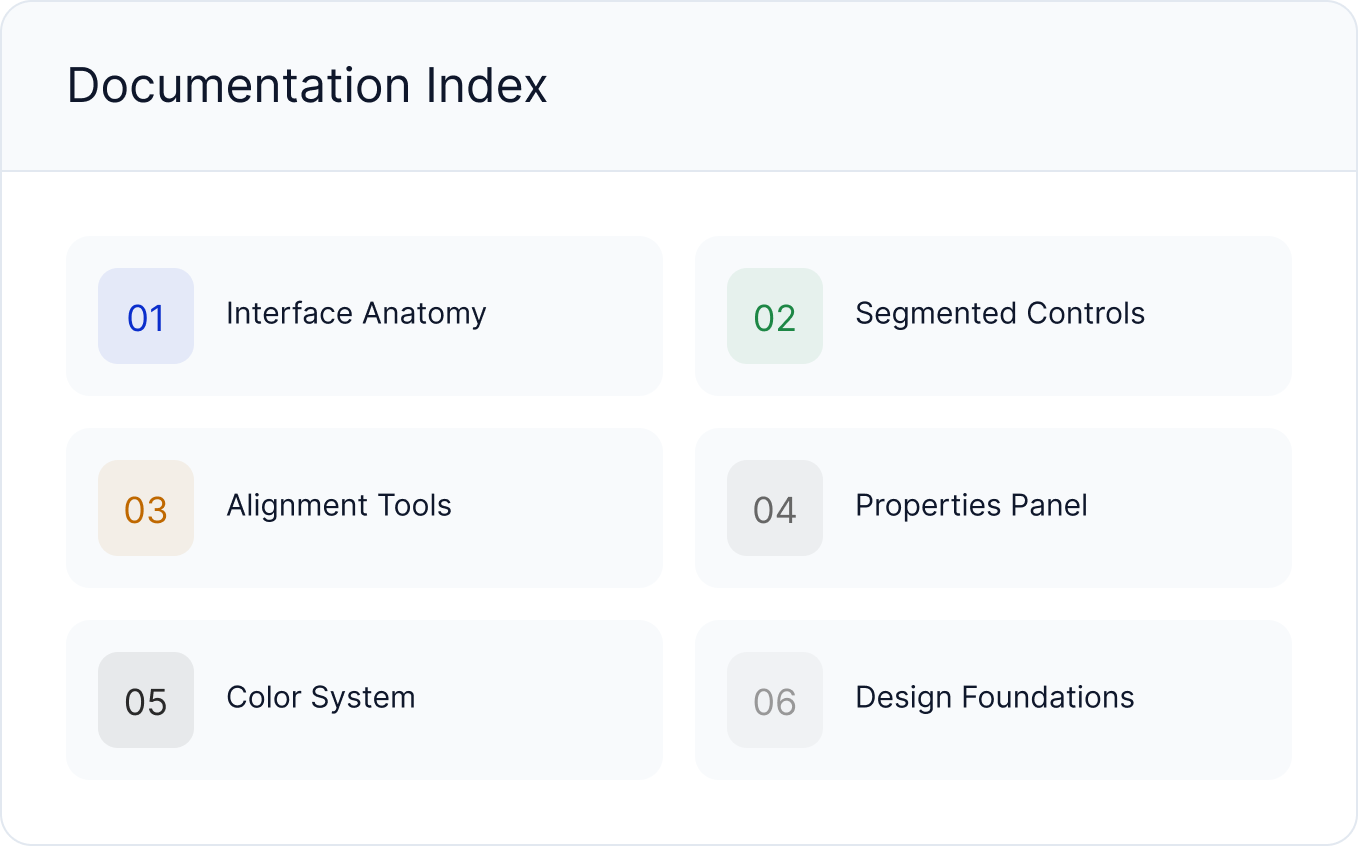
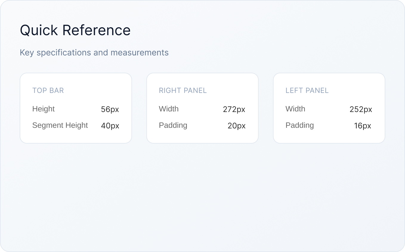
Interface Anatomy
Complete breakdown of the editor interface structure and component hierarchy

Segmented Controls
Mode switching controls for Preview, Question, Logic, and Design views
